By Karl F. Volkmar
Troy Dugas, The Shape of Relics, Arthur Roger Gallery, New Orleans, LA.
The Shape of Relics, presenting new work by artist Troy Dugas, provides a fascinating, intriguing, and interesting experience for viewers familiar and new to the artist’s work. Those for whom the artist’s work is new will have the delightful experience of exploring their way through the intricately patterned iterations of these amazing tessellations for the first time. Those in the know, already familiar with the artist’s earlier work, will have the satisfaction of the insider witnessing the evolution of earlier themes into new variations of recursive patterns. Of interest to both will be the artist’s radical essays into the new subjects of portraits and still lives with their historical and representational references and new ways of working with materials. New expressions of the intricately patterned mandala idea focuses one’s attention away from peripheral distractions and into the minutiae of their making, into meditation on visual pattern and movement as the eye becomes involved in deciphering the complex interrelationships among patterns, rhythms, and repetitions.
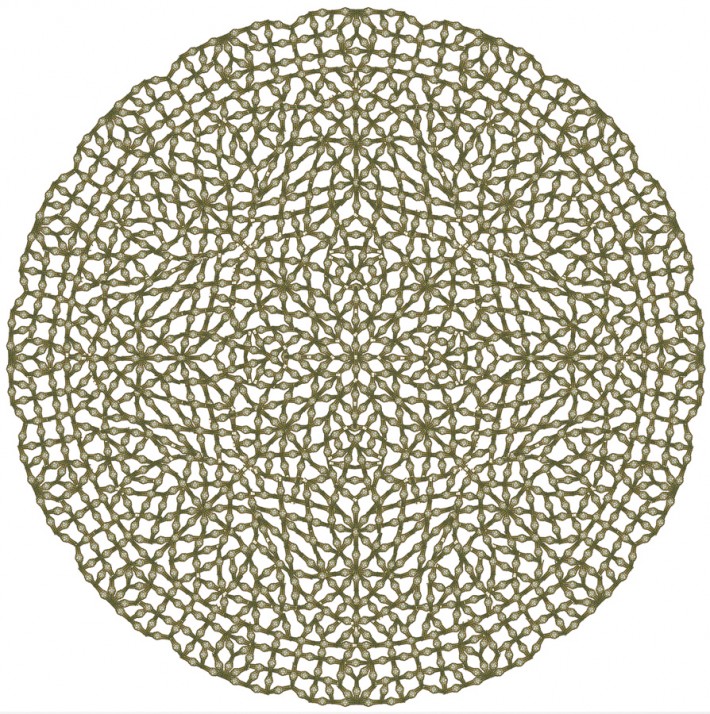
One place to begin one’s exploration of what is new is to begin with the beautifully situated, earlier (2009) Bueno de Portera, a large, seventy-two inches in diameter work of intricate interlace design suspended like an apparition in a vision in a cloud of light in the small rear gallery. From a distance contour rivalries among adjacent and overlapping recognizable shapes and patterns vie for the viewer’s attention in her search for clarity in what may at first seem chaotic. Just as one shape or pattern is discerned only to dissolve into seemingly indecipherable complexity other shapes and patterns emerge from the field in a continuing dynamic of figure ground reversals and reversals and reversals.
One is drawn ever closer in the search for understanding only to become enrapt in tracing the making of the work. The nature of the material used to weave the lines of the design, the repetitive use of which inures the eye to their shape as the unique is overwhelmed by the intricacy of the design and its shifting focus, reveals itself as the characteristic shape of cigar bands becomes clearer on closer inspection. Only then may one notice that the artist has cut away the interstitial areas creating a relief effect such that the slightest unevenness in lighting creates subtle shadows and realizes that the whiteness one sees is in fact the surface against which the work is placed. After an extended period of looking one may experience an effect as if mesmerized reminiscent of a Rothko, an effect resulting in part from retinal fatigue due to the attention demanded by the intricate character of the design as if one were being lulled into an altered state of consciousness.
The more recent circular designs – Don Antonio, Fragancia, and Sun Ray Stub -on the smaller scale of forty-seven inches square, are like intricately tatted laces. Even though more densely complex than Bueno de Portera, the limited range of low key, medium values allows for clear delineation of shapes and patterns like fabulous snowflakes or the view upwards into elaborately designed mihrab or flamboyante vaulting. The effect is a more readable definition of the various subcomponents of the design, a more clearly articulated geometry, and an awareness of the repetition of modular motifs as the complexity of the design expands outwards from center to periphery.
The simultaneous evolution towards more complex dynamic and clarity of design realized through the use of different colors and patterns within an overall asymmetry is seen in the comparison between works like Fine Vieille from 2011 and Radial Forms Four #3 from 2012. Each is composed of four radial shapes arranged on a patterned ground. The rigorous geometry of the four shapes in Fine Vieille, each of which could have been the basic design for an independent work like the preceding, the dynamic of the ground pattern, and how each shape interacts with the patterned ground and in relation to each other is the cause optical effects that disrupt the integrity of the plane. In the later Radial Forms the two shape objects in the bottom row are asymmetrical within them selves. The patterned ground within/on which they are set seems as if distorted by the visual forces of the four radial shape objects like rocks deflecting the flow of a stream or the gravitational pull of a planet the flow of light from the sun. The different effect is due to a freer use of labels as materials in which their integrity as objects is subordinated to the needs of design rather than defining the design.

Troy Dugas. Bueno de Portero, 2009. Cigar bands on cut paper, 72 x 72 inches.
Other works from 2011 provide an extended overview of the artist’s ability to work with different approaches simultaneously. Salmon Decagon, measuring sixty by sixty inches, is an unusual ten-sided design, in which shapes are differentiated by pattern rather than contour lines. The effect is to create a pulsing dynamic of general expansion counterbalanced by the central area where outlined shapes seem as if they are moving towards the center. Big Muddy Red is a large seventy-five by seventy-five inches work in which shape rather than line creates visual currents of movement not unlike a crazy quilt through an equilibrium among centrifugal and centripetal and circumferential visual forces.
The Saint Jerome theme of earlier work continues in St. Jerome #4, St. Jerome’s Castle, and St Jerome #5. The latter two, dating from 2013, are on a much smaller scale, thirty-six by thirty six inches, vis-a-vis the earlier sixty inches square interweave de signs. The carefully planned patterns are like imaginative ground plans for fantastic chateaux along the Loire or in the backgrounds of the illuminations for the Very Rich Hours of Jean, Duke of Berry, or monasteries suitable for the intrigues in an Umberto Eco novel.
Astral Gears is a unique experiment in which circular rhythms of seven, fourteen, and twenty-one interacting with each other within a square format are countered by intricate variations of three/six in the center and sixteen around the perimeter, the varying ratios creating an explicit if subtle dynamic visual experience. The illusionistic volumes of the circumferential units suggest the influence of Roman-inspired decorative patterns found on medieval floors and on the ceilings of ecclesiastical architecture in Ravenna. From a distance, the blue interstices in the central area create evoke the sky. The rigorous tetra symmetry of Jewel Pride with its precise delineation and differentiation is like the view into or a Byzantine monastery church or a Baroque Borromini dome.
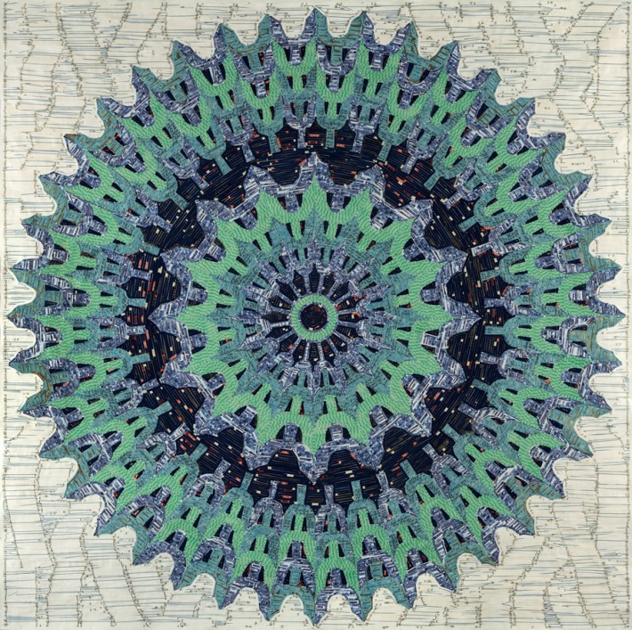
The large Rye Whiskey Blue represents another effect with its close harmonies of blue and blue green and a deeper blue. The rotational and radial tendencies of the composition result from the juxtaposition of shreds of labels in a way that creates patterns much as a gestural painter creates an active surface, one might think of Van Gogh, suggesting a more intuitive development of the design as the work evolves rather than being preplanned. This painterly quality creates rhythms within rhythms resulting in the deflection of the ground pattern as the normal line of the artist’s hand in its creation and the viewer’s gaze in its perception moves across the surface of the design.
Only in hindsight do these variations and differences prepare one for the startling still lives and portrait that represent a new direction in Dugas’ work. The proportions of the still lives, fifty by thirty-eight inches, appropriate for the subject matter, are different from the artist’s earlier radial and tetra symmetries and circular and square formats. So too with the portraits for, although the wood panels are square, the heads as too the still lives are oriented with respect to the gravitational pull of the earth with the concomitant multidimensional orientations of up and down, left and right, and forward and back orientations.
Of interest when making art that references the world of appearances is how the artist achieves balance between representation and abstraction and where on the continuum between nonrepresentation and nature itself the artist positions his work. In this light Still Life #1 may be a transitional work in which the artist experiments with new possibilities. The fluid character of line, the regularity of the mandalic medallion drawings in the background, and the leaf-like shapes are all elements that can be found individually in many of the works referred to above. But in the still life the artist deals with the problem of natural forms rather than non-representational design. These seed elements like the individual proteins and genes in a DNA molecule are recombined to provide the flexibility required to give the impression of fluid organic form.

Troy Dugas. Rye Whiskey Blue, 2012. Vintage labels mounted to paper, 72 x 72 inches.
Influenced by the work of Matisse and perhaps Dufy, Dugas incorporates sketches from the artist’s sketchbook, designs that otherwise may have become one of the large label mosaics, to populate the background like chakras of inspiration. A curvilinear serpentine line that befits the organic nature of the subject and the newness of the idea, hinted at in the distorted fields and asymmetries of Radial Forms Four #3 and Rye Whiskey Blue, suggests that the artist might have had to shift towards representation in order to develop in the new tendency, i.e., a movement from non-representation to abstraction that mirrored that from representation to abstraction to non-representation in the development of modern art.
Still Life #2 and Still Life El Mezzo involves a new method of working in which shapes are cut from earlier non-representational patterned works by the artist. Although first glance suggests a technique of pasting individual pieces one by one, close inspection reveals the truth, an amusing methodical pun on the artist’s unique process. The artist’s art provides the ‘raw’ material for the artist’s art. This new pattern sense has affinities with the art of artists like Vuillard and the early Bonnard who called themselves the Nabis as well as Matisse and early experiments with collage.
Like the still lives, the portraits – Fayum Clos du Calvaire, Fayum Blue, Fayum Prince, Fayum Leaf Hair – presented their own problems that needed to be resolved. Inspired by the encaustic portraits from the burial grounds at Fayum in Egypt, dating from the Roman occupation, the lifelike naturalism of the faces of the deceased was a source of fascination different in kind from the mandalic meditations. Guided by an intuitive sense of design that echoes the early Matisse in paintings like Madame Matisse and Woman with a Green Stripe, Dugas re-represents the planes of naturalistic verisimilitude as areas of pattern.
Patterns as parts of larger patterns and patterns of patterns simulate the relative values of the naturalistic modeling of the en caustics. Pattern vis-a-vis pattern simulates contour lines. The artist’s deft arrangements create a situation in which shape challenges shape, shape qua shape vies with representation, and design competes with illusion in a way that may have more in common with elaborately tattooed Marquesans or the generalized planes of the Byzantine transformation of Greco-Roman naturalism.
The viewer finds oneself caught up in the web of visual rhythms, assertive planes that subvert the pictorial much as the iteration of promotional material numbs awareness, and the dis solution of representational into non-representational and purely formal design relationships. It is interesting to consider how the experience of the works changes from that of the maker to that of the visual consumer. In the making the work lies horizontally as the artist works standing over and looking down. The viewer sees what the artist sees equidistantly hanging on a wall as a visual not tactile experience with an up and a down orientation. How might this affect the nature of the experience of these works whether mandalas or still lives or portraits?